

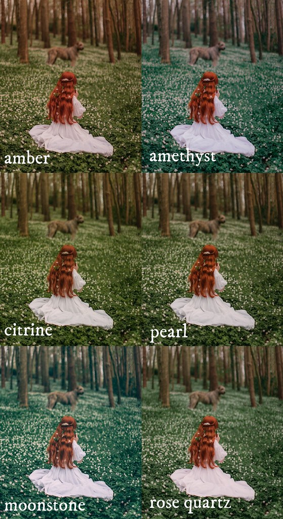
All of the presets in my shop are on sale right now! The preset packs are usually £30, but right now they are all marked down to £20 (or $25). The Harvest Pack features 6 distinct presets and the Winter and Spring packs feature 8 presets each (so the price is around $3 per preset!). All preset packs are available for purchase in three versions: Lightroom desktop, Lightroom mobile, and Photoshop/ACR. If you only edit on your phone then Lightroom mobile is a great option; the app is free and you can use these presets to minimize your editing steps and give your photographs a similar look to mine. All packs come with instructional files on how to import them into your applications as well. Right now I edit all of my pictures with my spring pack which is titled the Bloom Pack. It features 8 distinct presets that work together for a cohesive feel, but also tackle different issues. Some are warm-toned, others are cool, and some can really help bring a punch to your photographs. All of the examples in this post are shown with the preset applied and no additional edits, although I always recommend tweaking things on your own photographs to really make them sing!

The Cherry Blossom preset is probably my most-used preset this spring. It's actually not a good preset to use on photographs with a lot of yellow, but for greens and pinks it is amazing. It really makes pink pop and gives greens the prettiest tone; I also like it for smoothing and evening tones for a really soft "mood." If I could describe it in one word I'd probably say "soothing."

Lilac is a slightly purple-tone preset (and I did actually use it on my lilac pictures that I took last month). On non-purple pictures and flowers, it's a great preset for adding some contrast and brightness to photographs without overly altering colors or changing the mood of an image. Like in the set above, taken on a sun day with a bit of sunstreaking happening in the lens; the finish photograph has the same effects and feeling, just a bit more punch and the colors are more realistic to what they were in person.
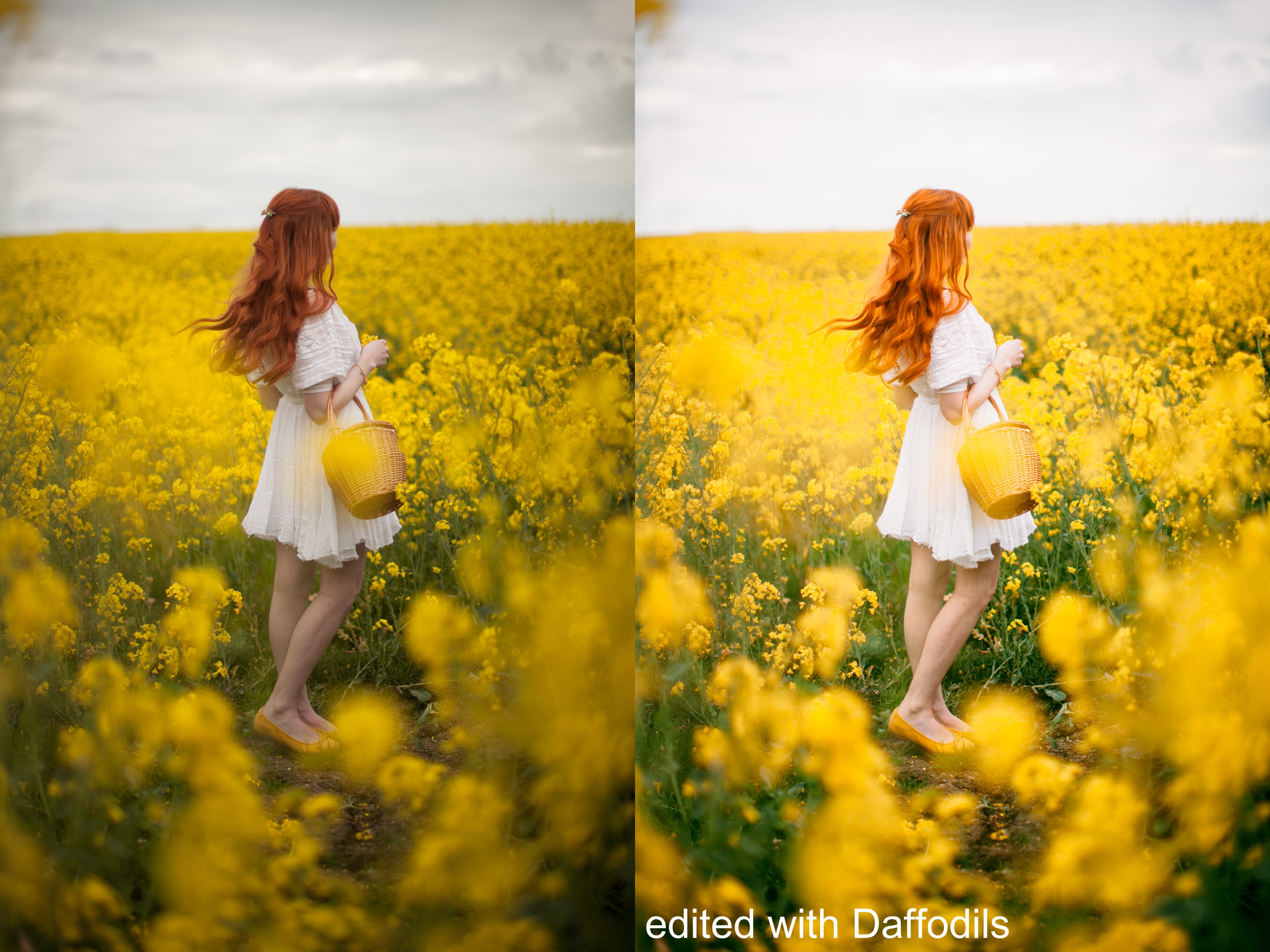
The Daffodils preset is perfect for really punching up pictures. If you like a dramatic result from your presets, then this one delivers. It's bright and highly saturated and perfect on slightly gloomy or "muddy" pictures. I use it often on pictures taken on wet or grey days that come out a bit blue and dark; in those settings it helps get the colors back to what they look like in real life.
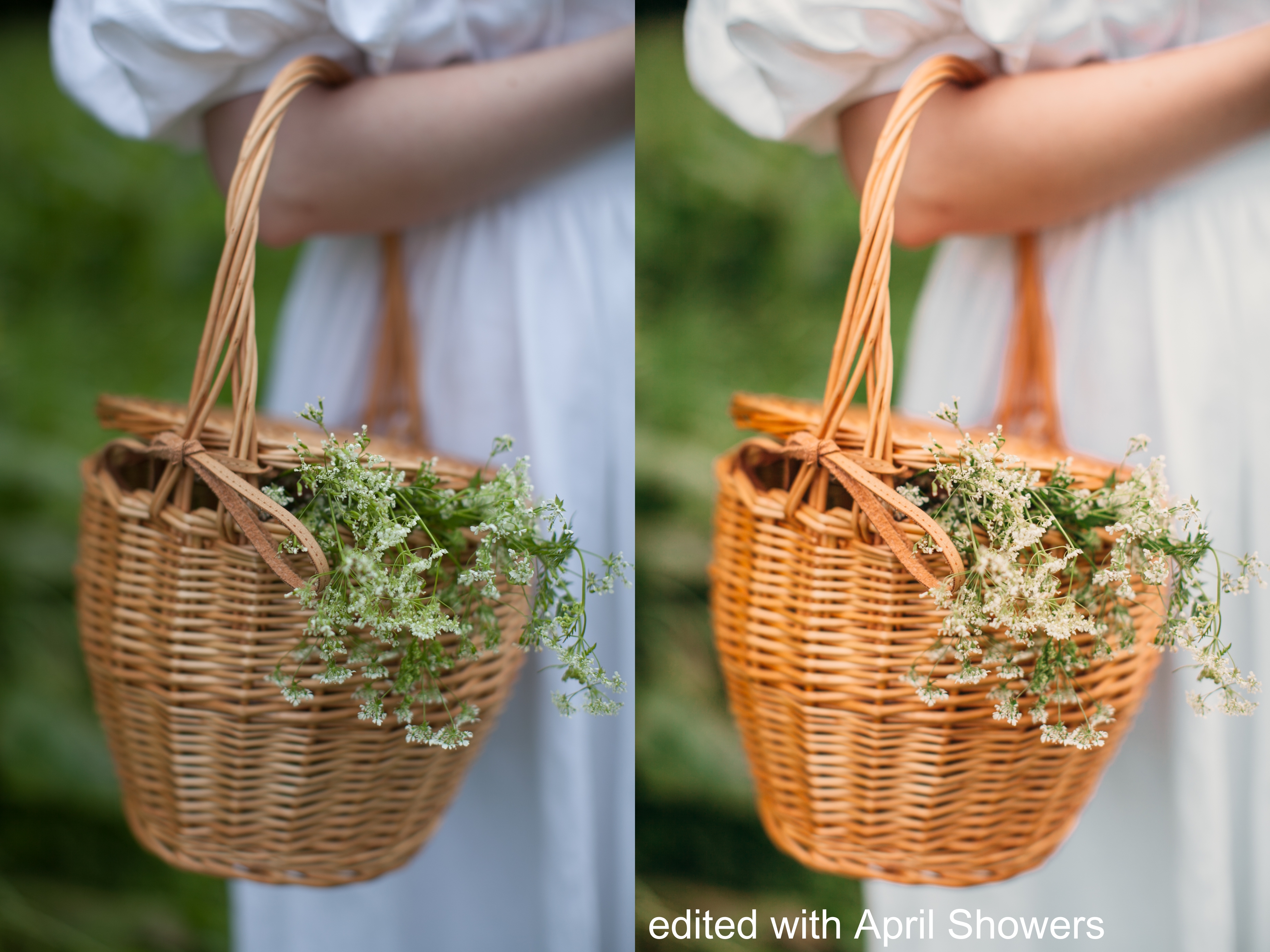
My April Showers preset is also designed with wetter days in mind (I try to design presets to address various issues/types of images), but it's less saturated and much more warm-toned than others in my pack. This one gives photos a "golden hour" feeling even if the conditions you are shooting in are the exact opposite!
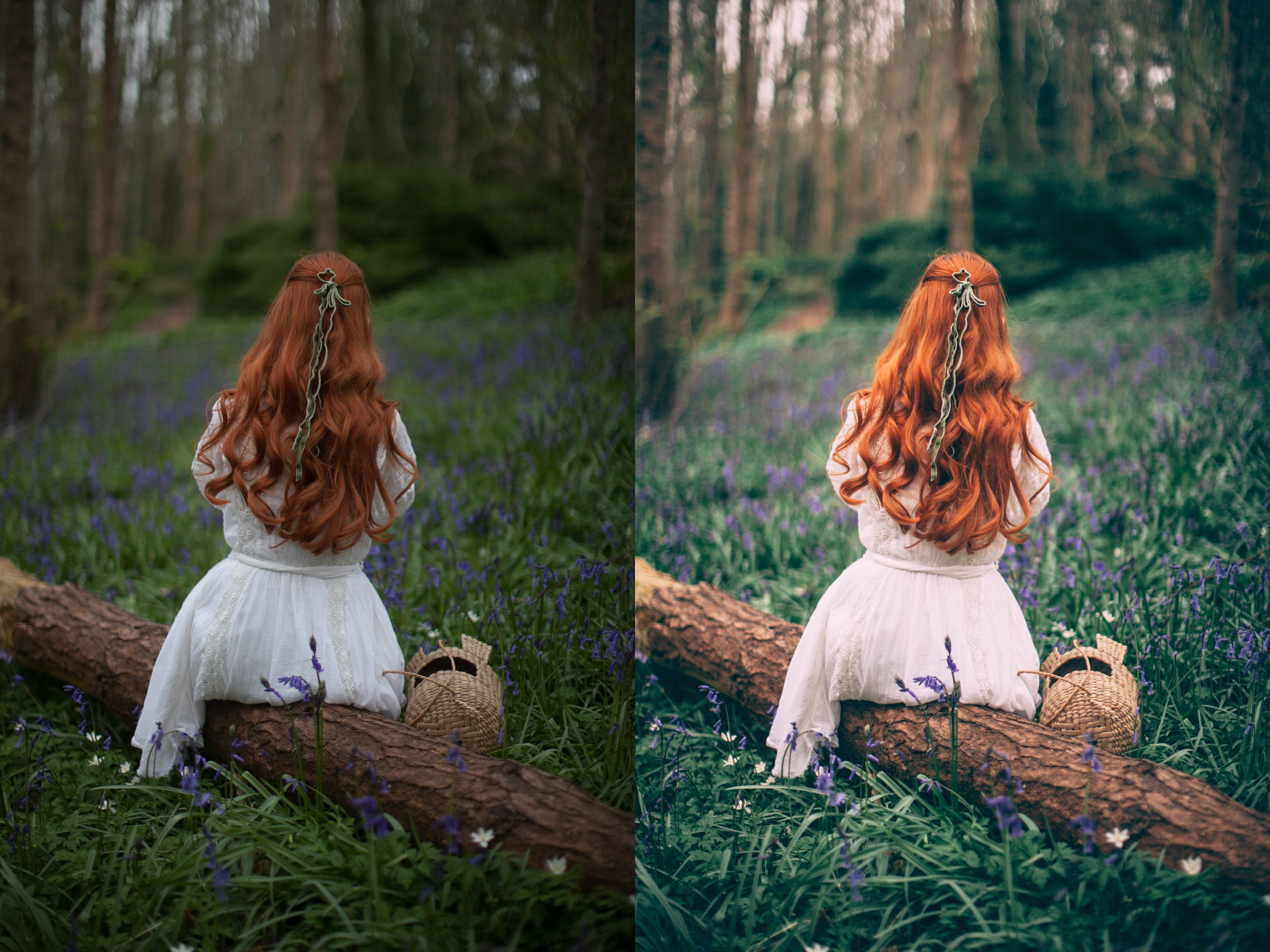 If you prefer cooler-toned photographs or just find your pictures always turn out too warm, then bluebells is a great preset to bring out blues. I like it for my more woodland based photographs where the light is naturally a bit more filtered and the greens tend to be more blue-toned. It is also great for photographs featuring blue and purple flowers.
 Wild garlic was the first spring preset I made and really felt happy with; it's a perfect sort of smoky preset. A mix of cool and warm tones, it's a great universally flattering preset that will work on most photographs. I like how it sort of diffuses light and gives photographs a gentle vintage wash.


CONVERSATION